

Rakuten Rewards Mobile Redesign
Led redesign of Rakuten Reward's iOS and Android app experiences used by millions of shoppers, leading to 36% increase in clicks on the homepage and 3% increase in order conversion.
My role
Designer Researcher
What I did
Research Wireframes Prototypes UI Design
Timeline
6 months
Tools
Figma Usertesting.com Optimal Workshop Amplitude
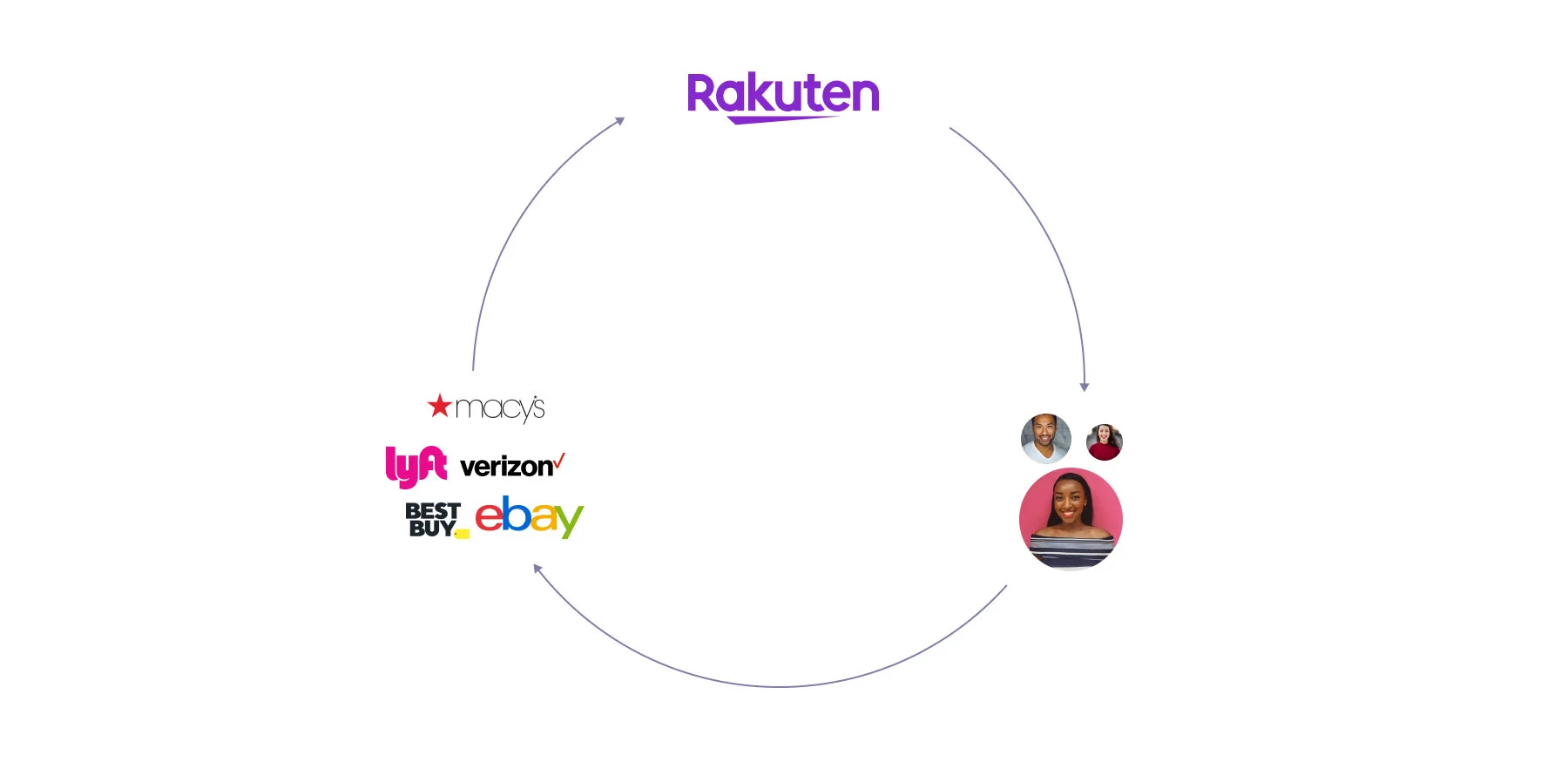
What is Rakuten Rewards?
Rakuten Rewards is a leading affiliate marketing platform.
- Companies like Lyft and eBay pay Rakuten Rewards a commission for sending users to their sites.
- Rakuten Rewards splits that commission with users in the form of cash back.
- When users shop on the Rakuten Rewards website or apps, they're rewarded with cash back for their purchases.
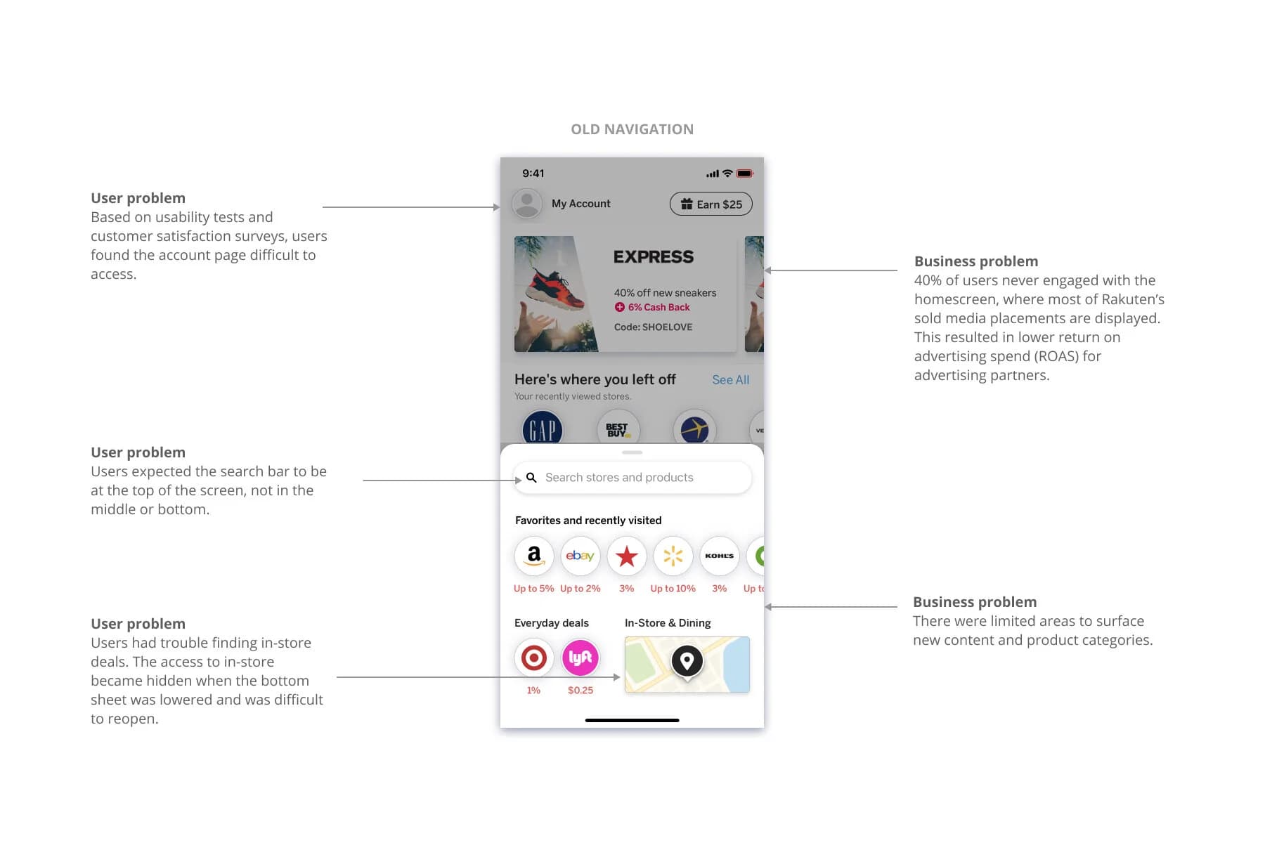
The problems
My process

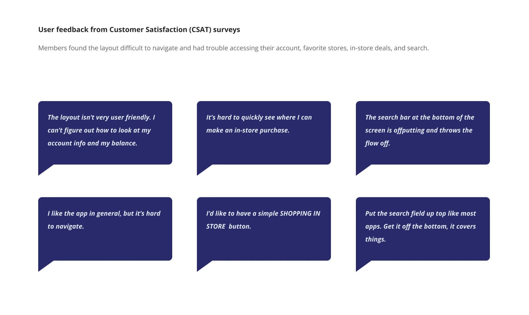
Align: Customer feedback and competitor research
Before this project kicked off, I worked closely with business stakeholder, user researchers, and my design leadership to align on the need to address these navigation problems.
I brought stakeholders together and shared direct user feedback highlighting their frustrations. I also shared research on industry standards and navigation best practices and how our navigation was deviating from these.
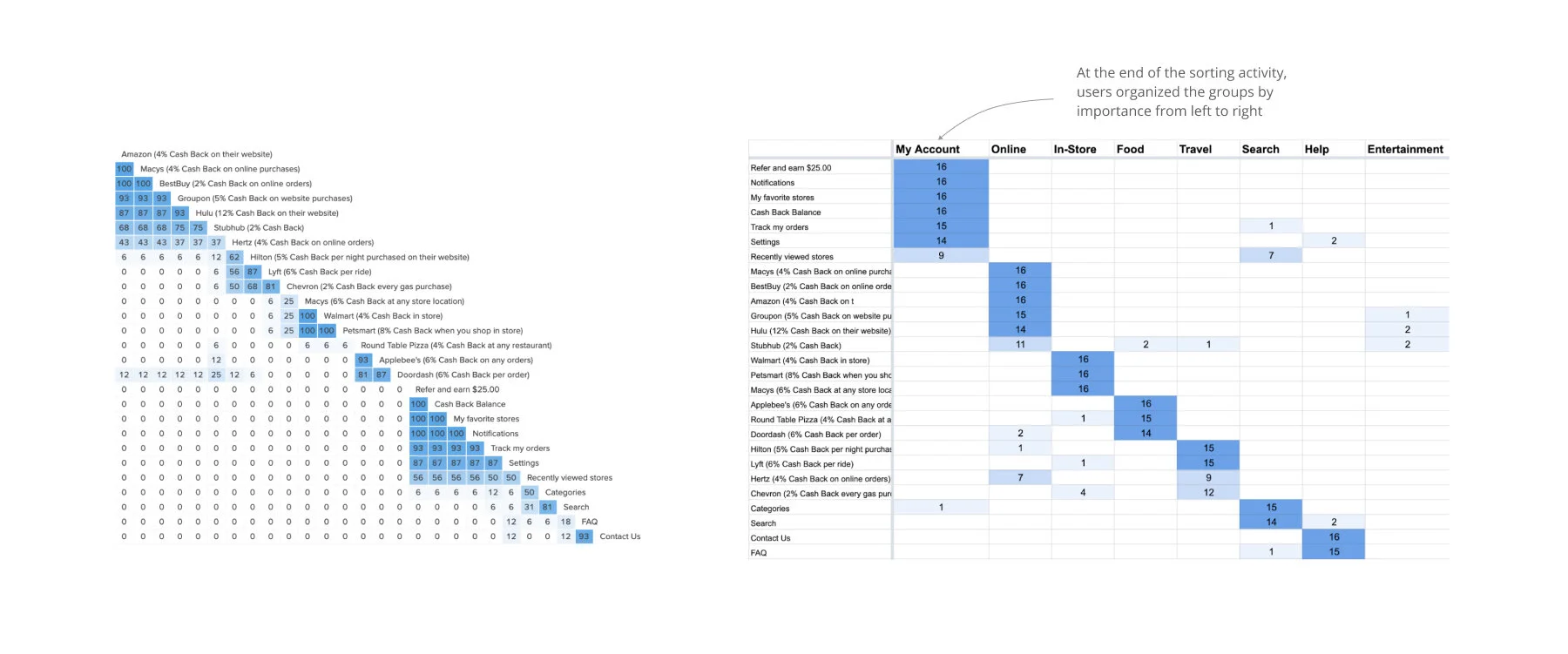
Research: Card sorts reveal users' mental models
I conducted a series of open and closed card sorts with existing users. These card sorts helped us understand users' mental models for organizing content and what content was most important to them.
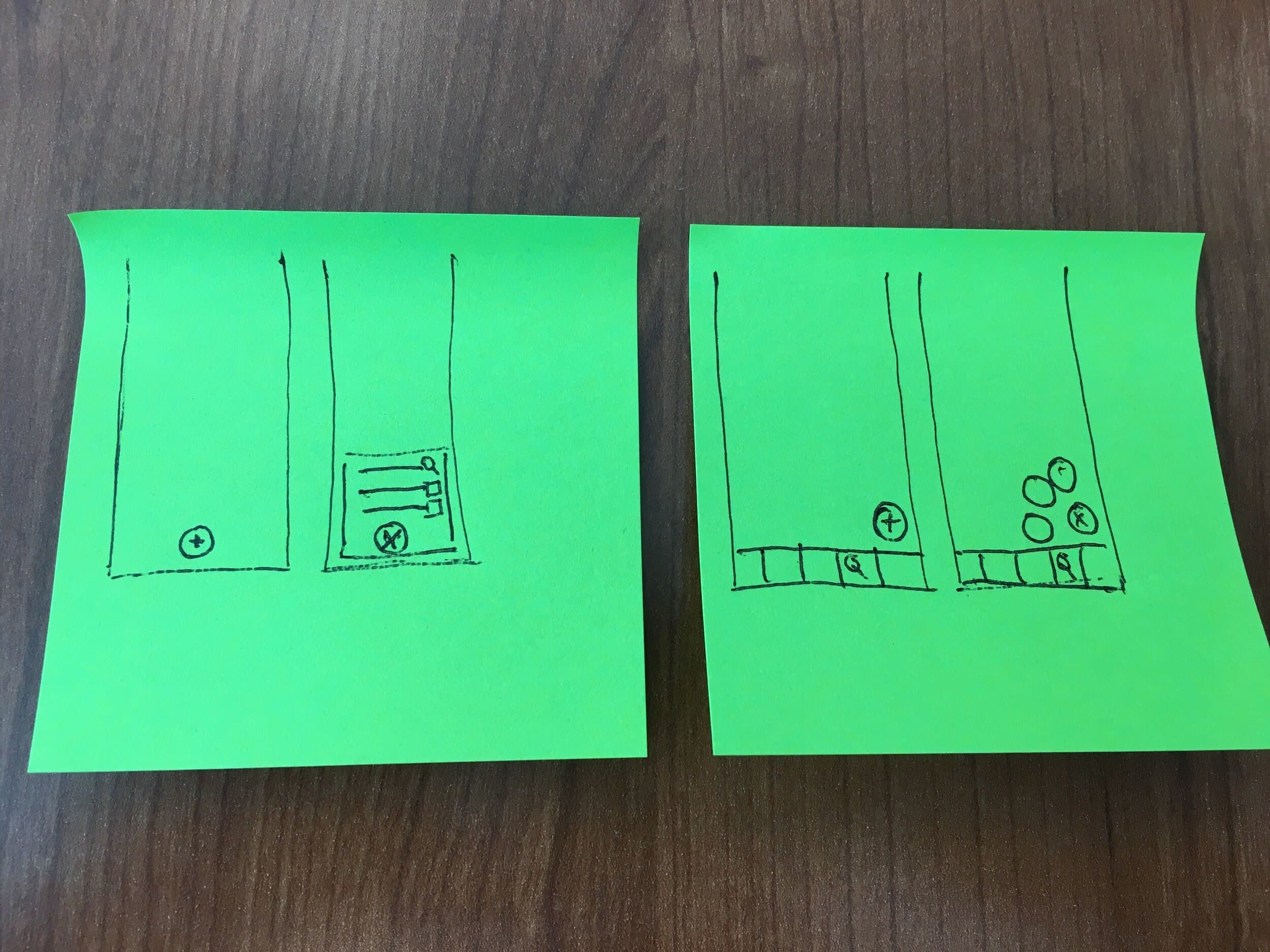
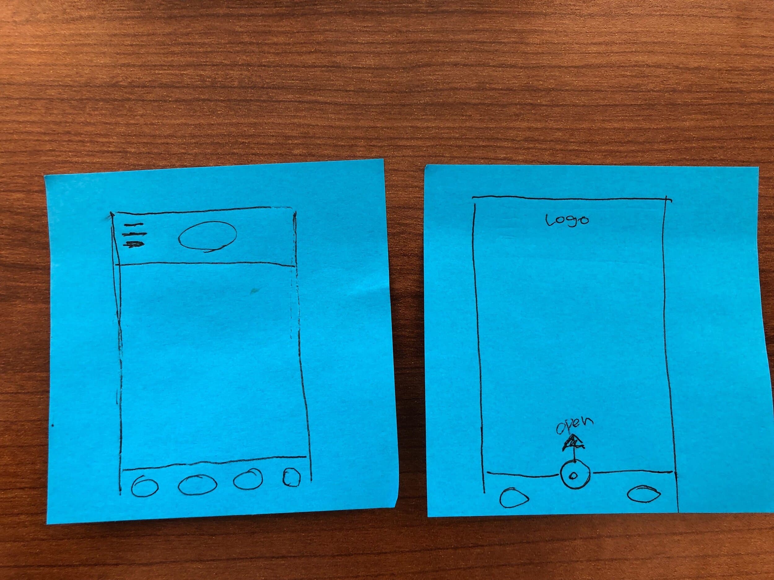
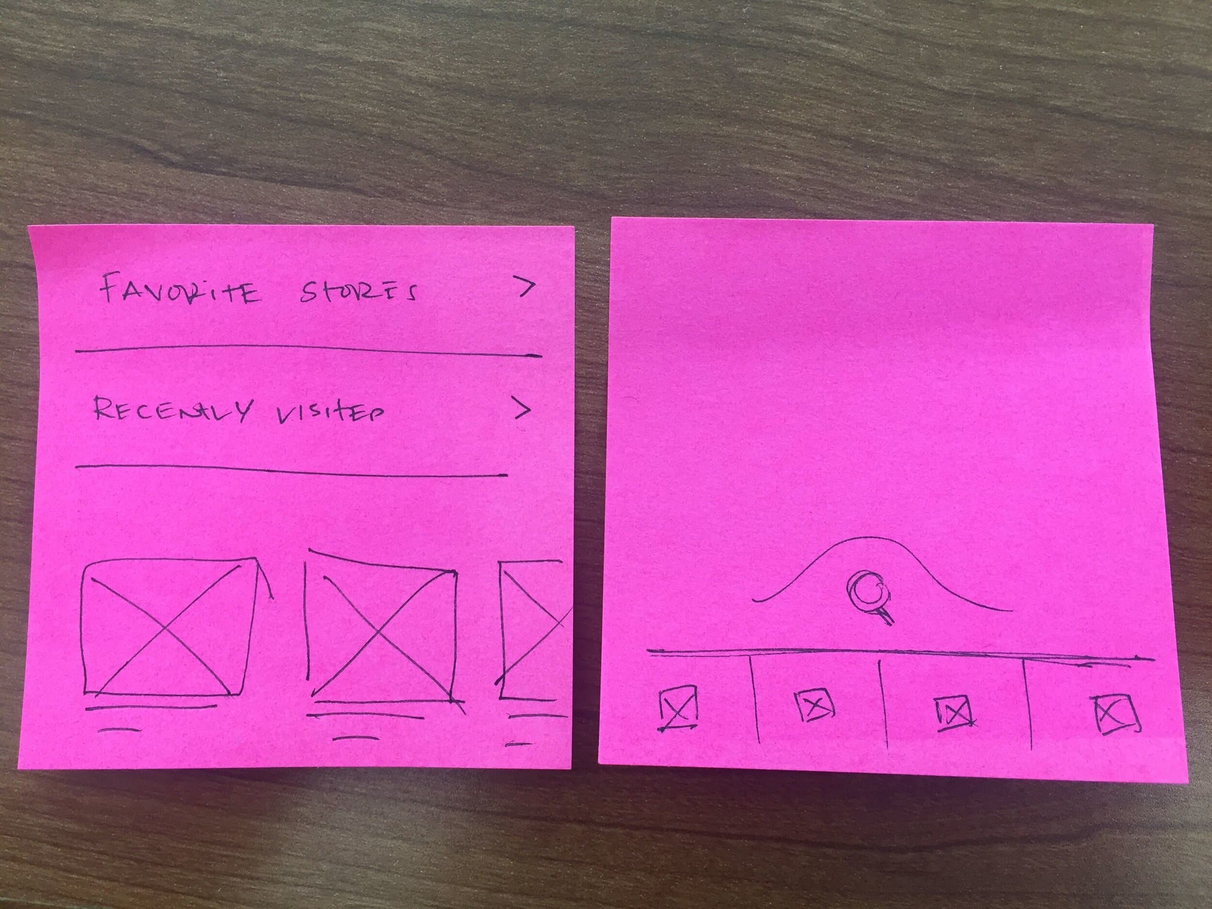
Ideate: More heads are better than one
I facilitated a brainstorm with seven designers, using a mix of in-person post-its and remote tools like Zoom and Slack. I began by sharing key research insights and user and stakeholder needs.
We centered the session on the prompt: “How might we reimagine navigation to make key features easy to access while encouraging content discovery?”
Converging on a design direction
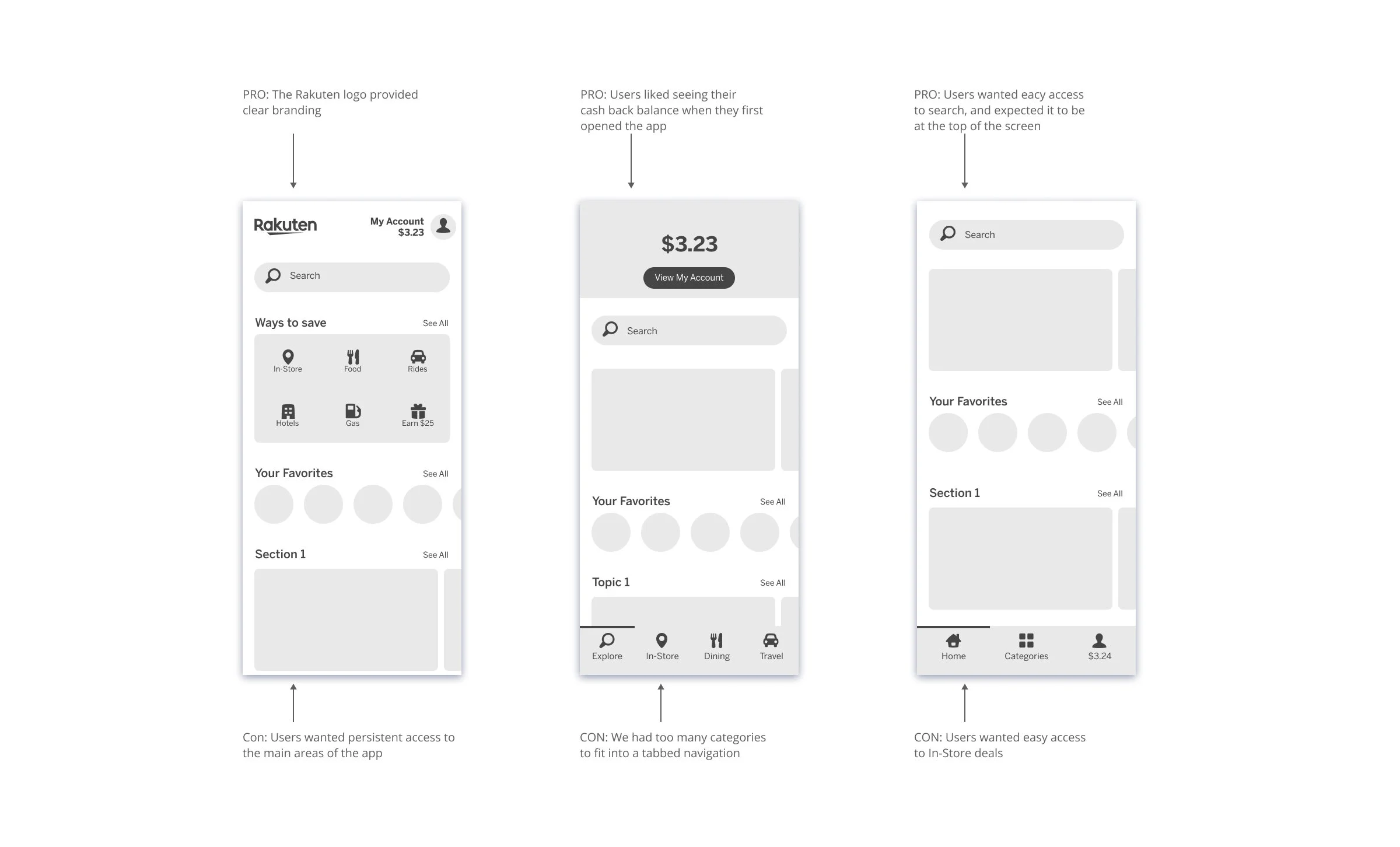
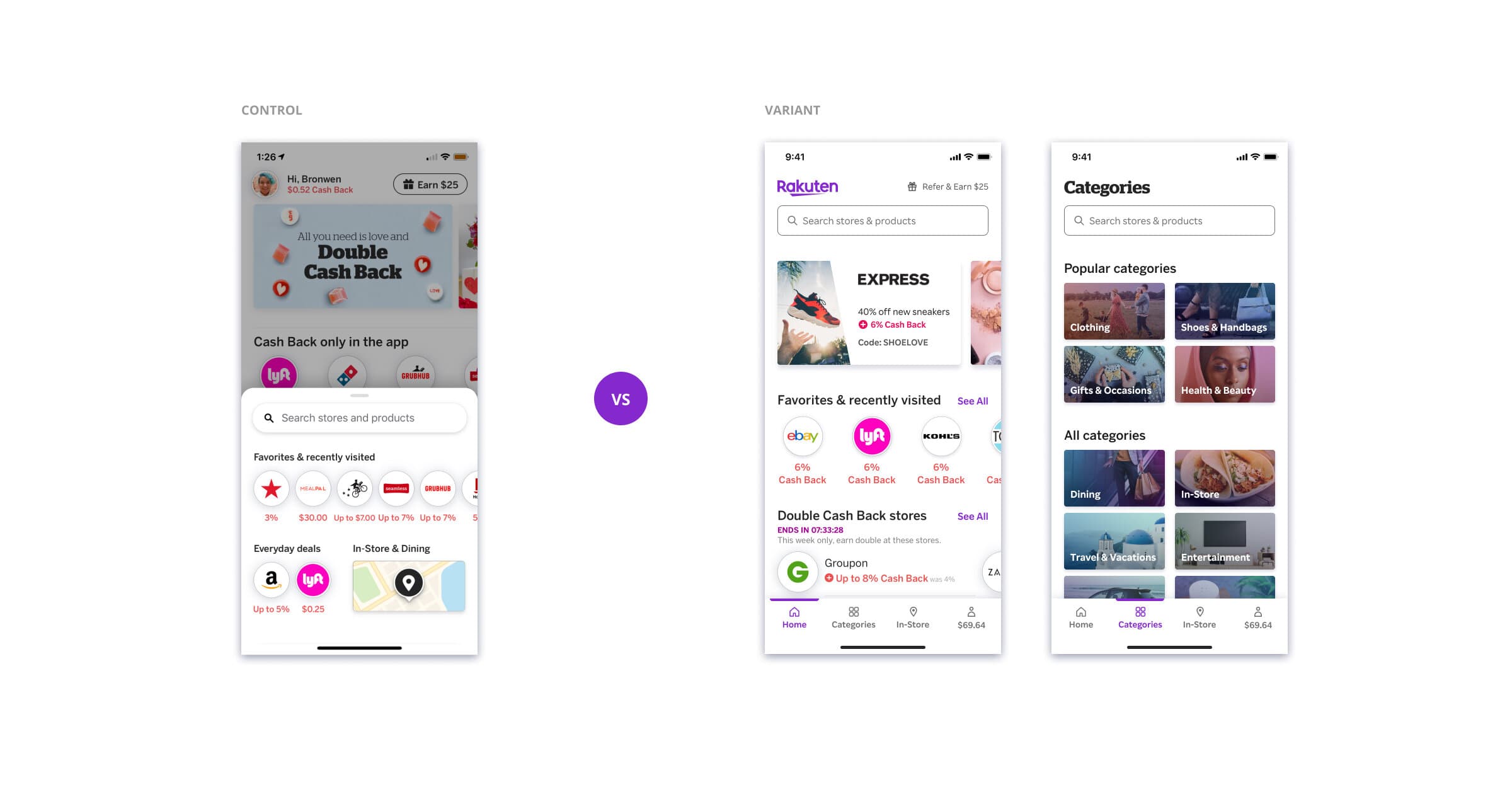
I explored multiple layouts to balance easy access to search and account with clear category visibility, while reserving prominent space for paid media.
Wireframes helped gather feedback and align on a final direction.
Test: Assessing usability
I conducted two sets of usability tests.
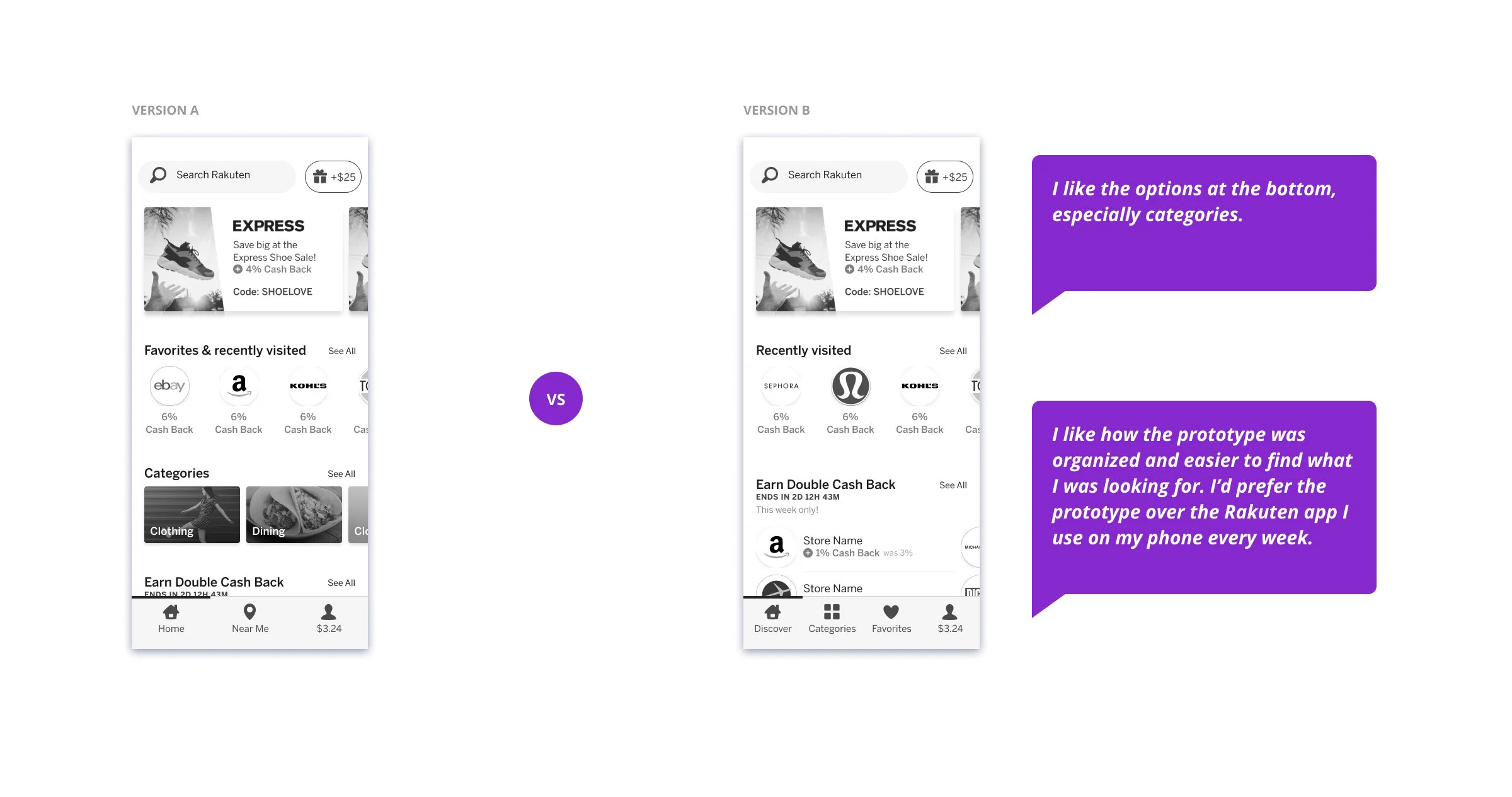
In the first usability test, 8 existing and 8 new Rakuten users compared two navigation prototypes, shown in randomized order to reduce bias. Low-fidelity designs enabled faster iteration and kept participants focused on overall structure rather than visual details.
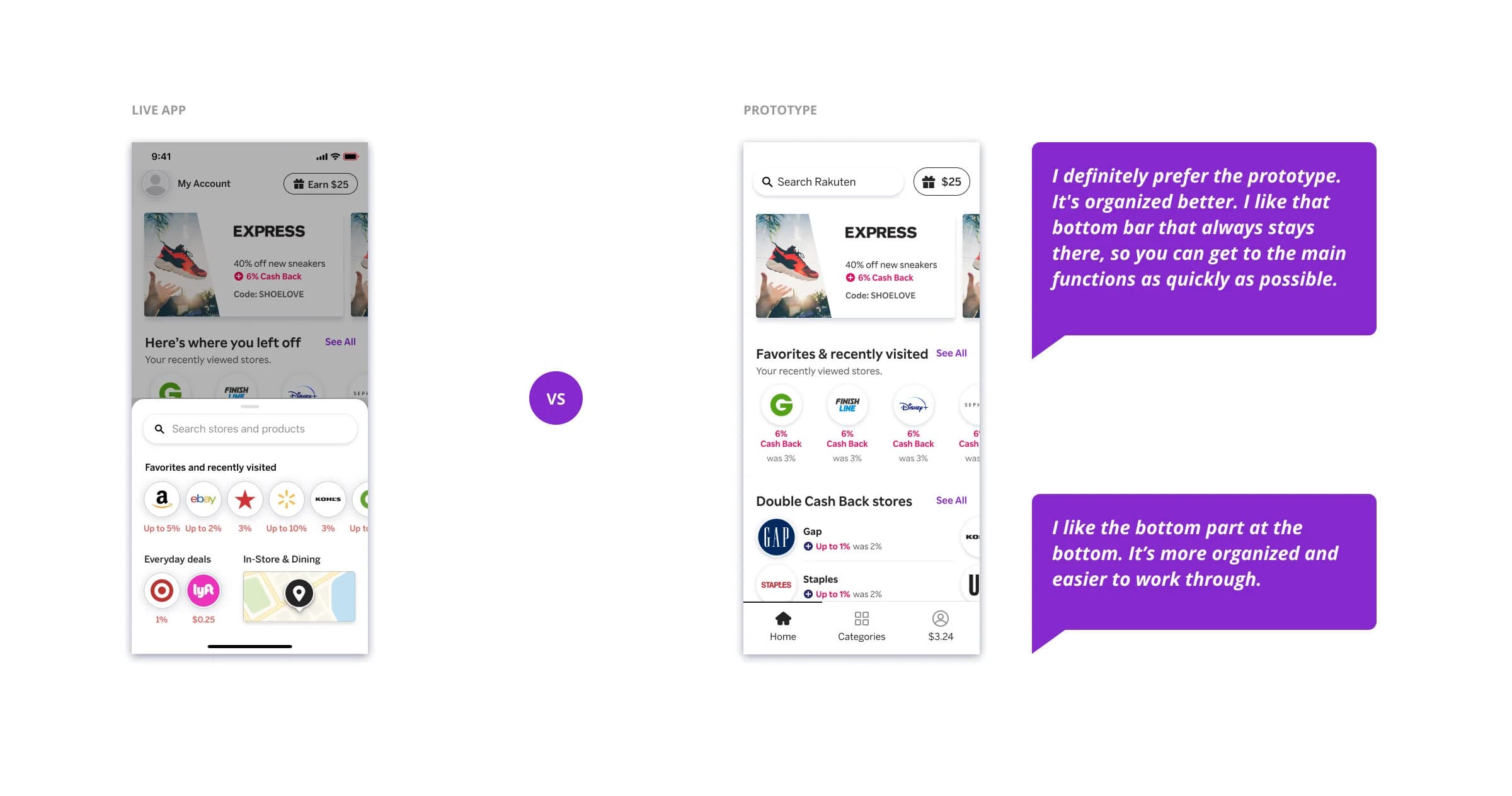
In the second usability test, 8 existing and 8 new users compared a prototype to the live iOS app, with order randomized to reduce bias.
Build: Developer handoff
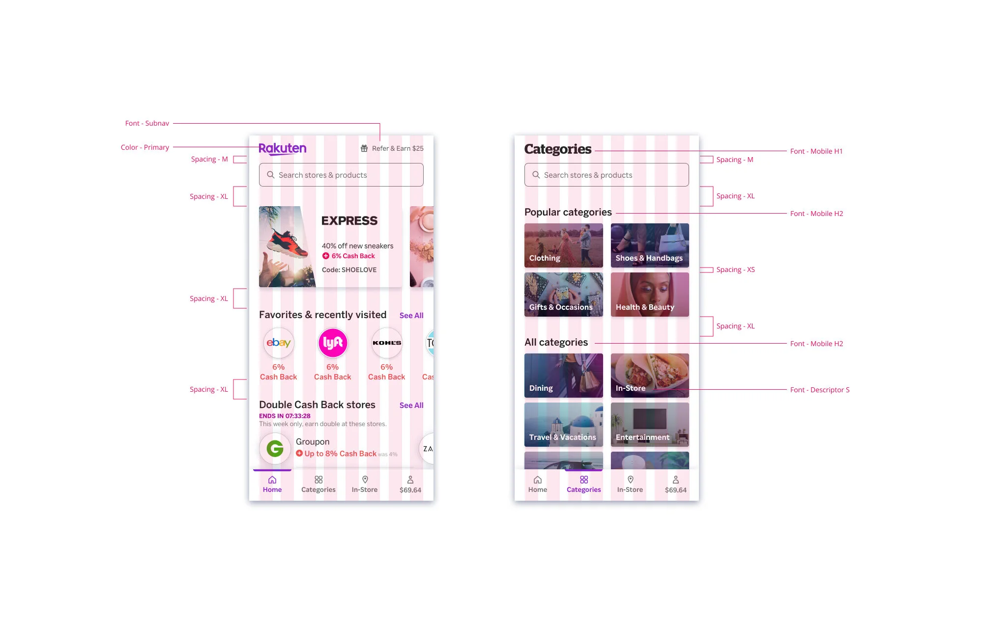
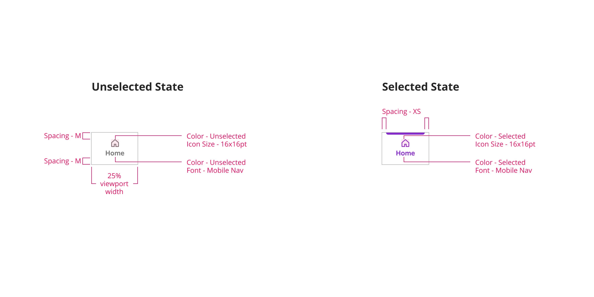
I worked closely with iOS and Android front end developers to implement the new navigation interface. Developers were able to get most specs directly from Figma, which created a very efficient workflow and allowed Figma to be a single source of truth.
I created redlines where needed. These redlines were especially helpful to specify design tokens used for colors, spacings, and fonts.
Results: The proof is in the A/B test
Based on the usability test results, we felt confident about the design direction.
To truly understand the impact of our changes, we ran a randomized A/B test. The test was implemented through Optimizely and we used Amplitude to review the data. I was able to review the results in real time in Amplitude and clearly see when results had reached statistical significance.
Final results
36% increase
in clicks on the homescreen
3% increase
open app to order conversion
2% increase
open app to shopping trip conversion
36% increase
in clicks on the homescreen
3% increase
open app to order conversion
2% increase
open app to shopping trip conversion