Rakuten Rewards Shopping Experience
Designed improved shopping experience in Rakuten Rewards mobile product, leading to increased usability and ad revenue.
My role
Designer Researcher
What I did
Research Wireframes Prototypes UI Design
Timeline
3 months
Tools
Figma Principle Usertesting.com Amplitude
The problem
Our previous experience did little to introduce users to new stores—if they weren't already familiar with a store, there was minimal support to help them decide if it was worth exploring. This was a missed opportunity, as our data showed that users who shop across more stores spend more and earn more cash back.

Users engage more with products than stores
We ran a quick, no-dev test using existing components to evaluate the idea, showing two Father's Day blocks on the mobile homepage: one featuring stores, the other products. Because product selection required manual curation, we chose broadly appealing items under $50 to target impulse shoppers.
Products drove ~4x higher engagement than stores, and a follow-up test with a different theme showed similar results—giving us confidence that surfacing specific products creates a more compelling browsing experience.

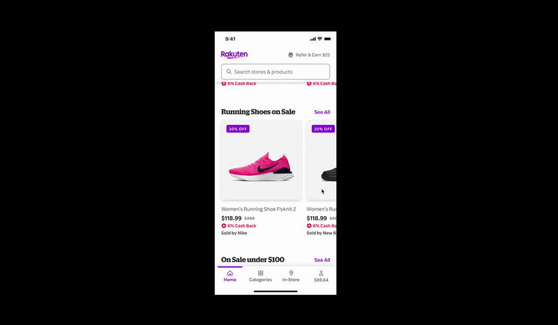
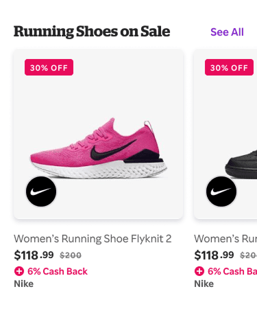
Designing the product component
Before designing, I reviewed e-commerce patterns and found product components consistently included an image, name, and price, typically shown in a carousel or two-column grid. I used these insights to explore a range of component options.
I validated designs through usability testing with 10 Rakuten users and ongoing feedback from stakeholders and the design team, while ensuring all visuals aligned with design system tokens.

Developer handoff
Once development began, I worked closely with iOS, Android, and web engineers to ensure designs were implemented correctly on all surfaces. I created documentation and specs, discussed the designs with developers in person, and conducted QA reviews.
Specs were handed off to developers using Figma, with more detailed redlines created where needed.

Final results
Once the component was built, we began surfacing products on the homepage. Personalized products were especially effective. They had an ~8% click through rate (CTR). This was one of the highest CTRs of any content on the app homepage.
In the first two weeks alone, products generated 84,000 shopping trips and $50,000 in media revenue.