Rakuten Mobile Redesign
Led redesign of Rakuten Reward’s iOS and Android app experiences used by millions of shoppers, leading to increased conversion.
My Role
Researcher
Designer
What I Did
Research
Wireframes
Prototypes
UI Design
Timeline
8 months
Tools
Figma
Usertesting.com
Optimal Workshop
Amplitude
What is Rakuten?
Rakuten (formerly Ebates) is a leading affiliate marketing platform.
Companies like eBay and Best Buy pay Rakuten a commission for sending users to their sites.
Rakuten splits that commission with users in the form of cash back.
When users shop on the Rakuten website or apps, they’re rewarded with cash back for their purchases.

The problems
Goal
As part of the Browse team, our goal was to help users understand what Rakuten had to offer and easily navigate to relevant content.
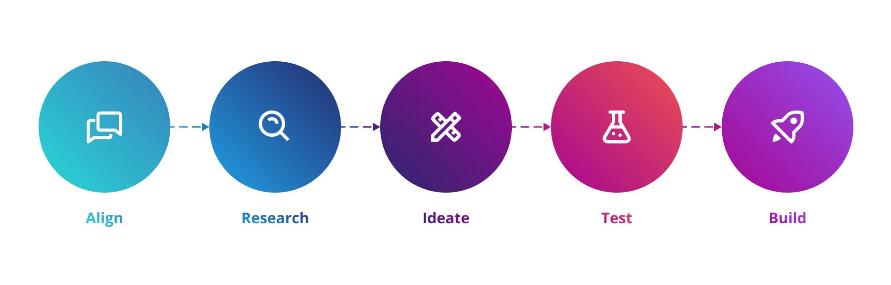
My process
Align: Customer feedback and competitor research
Before this project kicked off, I worked closely with business stakeholder, user researchers, and my design leadership to align on the need to address these navigation problems.
I brought stakeholders together and shared direct user feedback highlighting their frustrations. I also shared research on industry standards and navigation best practices and how our navigation was deviating from these.
Research: Card sorts reveal users’ mental models
I conducted a series of open and closed card sorts with existing users. These card sorts helped us understand users’ mental models for organizing content and what content was most important to them.
Ideate: More heads are better than one
To start out, I facilitated a brainstorm with seven other designers. The brainstorm included both inperson and remote participants, so we used a combination of old school post-its along with Zoom and Slack to collaborate.
I shared my research findings, reviewing the key needs of both customers and stakeholders.
The prompt for the brainstorm was: “How might we… reimagine the app navigation to allow users to quickly access important, frequently used features and encourage them to discover new content?“
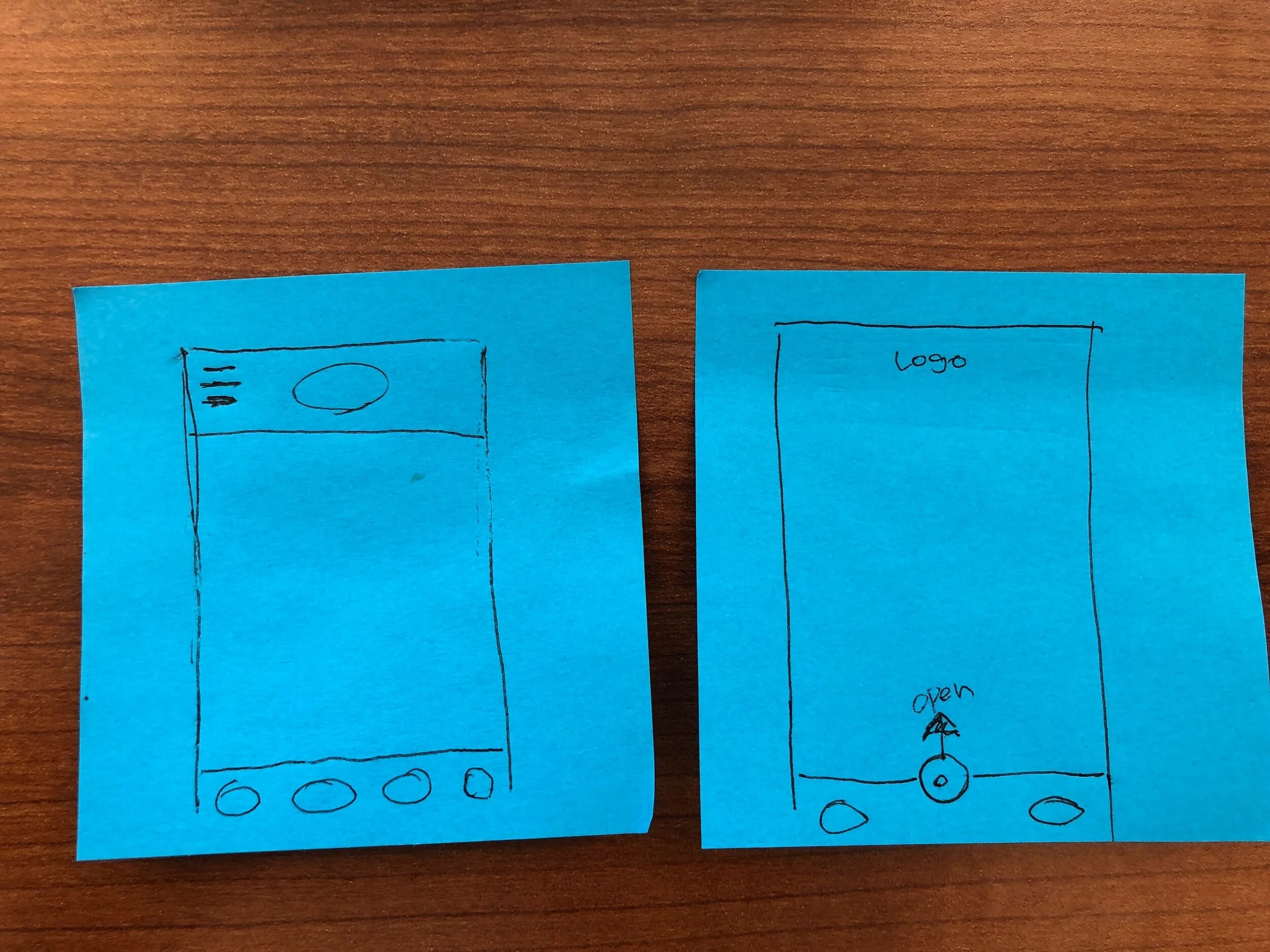
Sketches by Kihong Kim
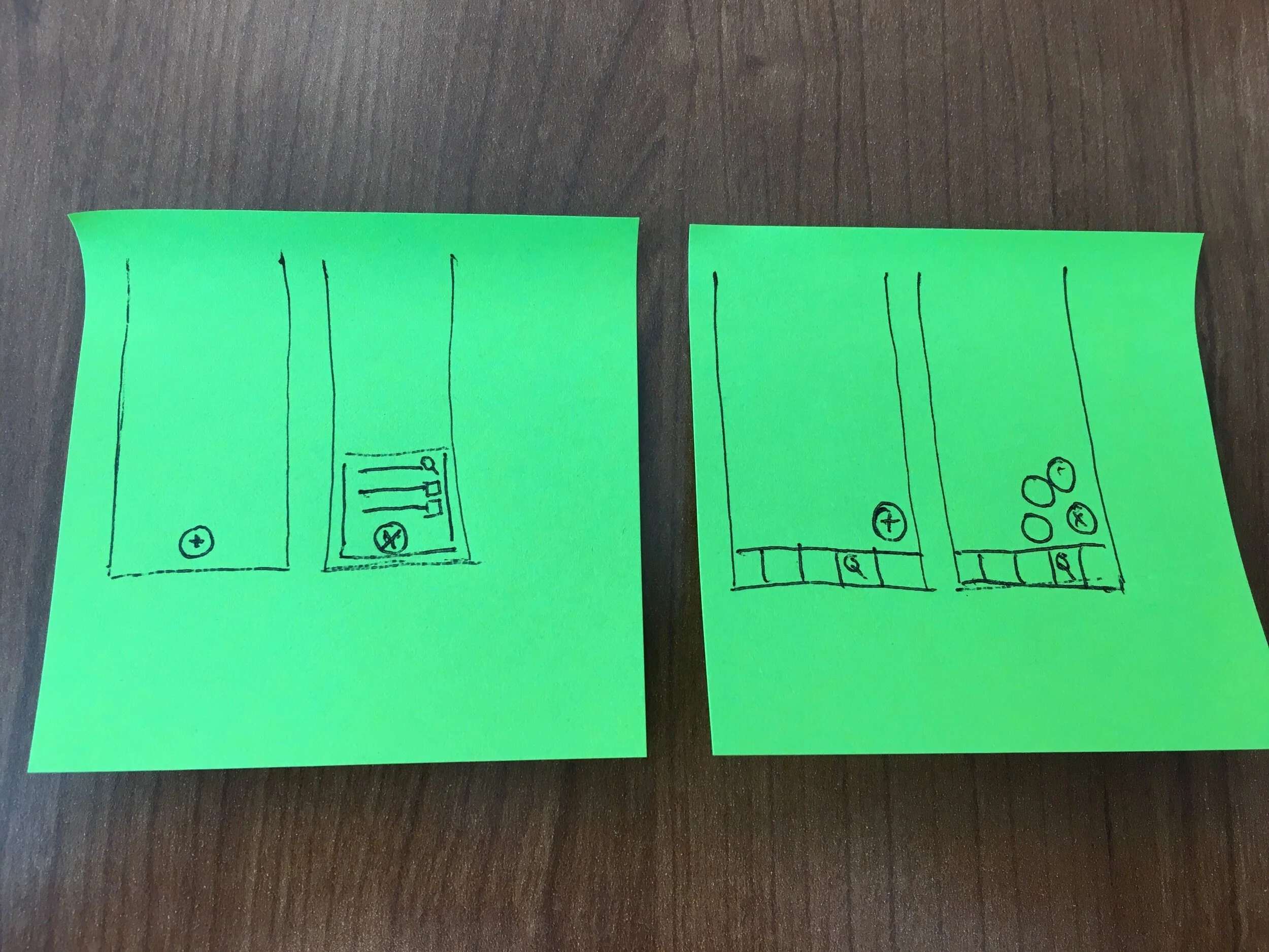
Sketches by Alban Carmet
Sketches by Sean-Paul Rocero
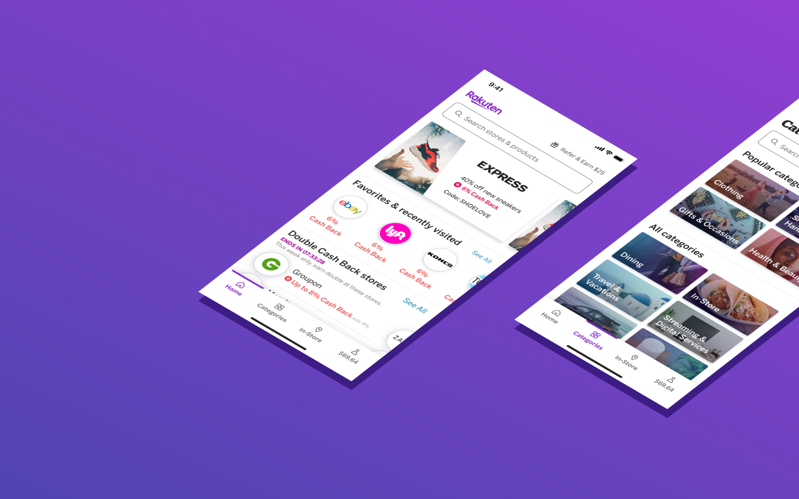
Improving the information architecture
Converging on a design direction
I explored a variety of layouts. My main focus was on keeping search and account easily accessible, while also providing a flexible space highlighting the variety of different categories available on the Rakuten platform.
Throughout, I had to keep in mind the key business need of giving high visibility to sold media placements. This meant there needed to be highly visible space on the home screen reserved for these placements.
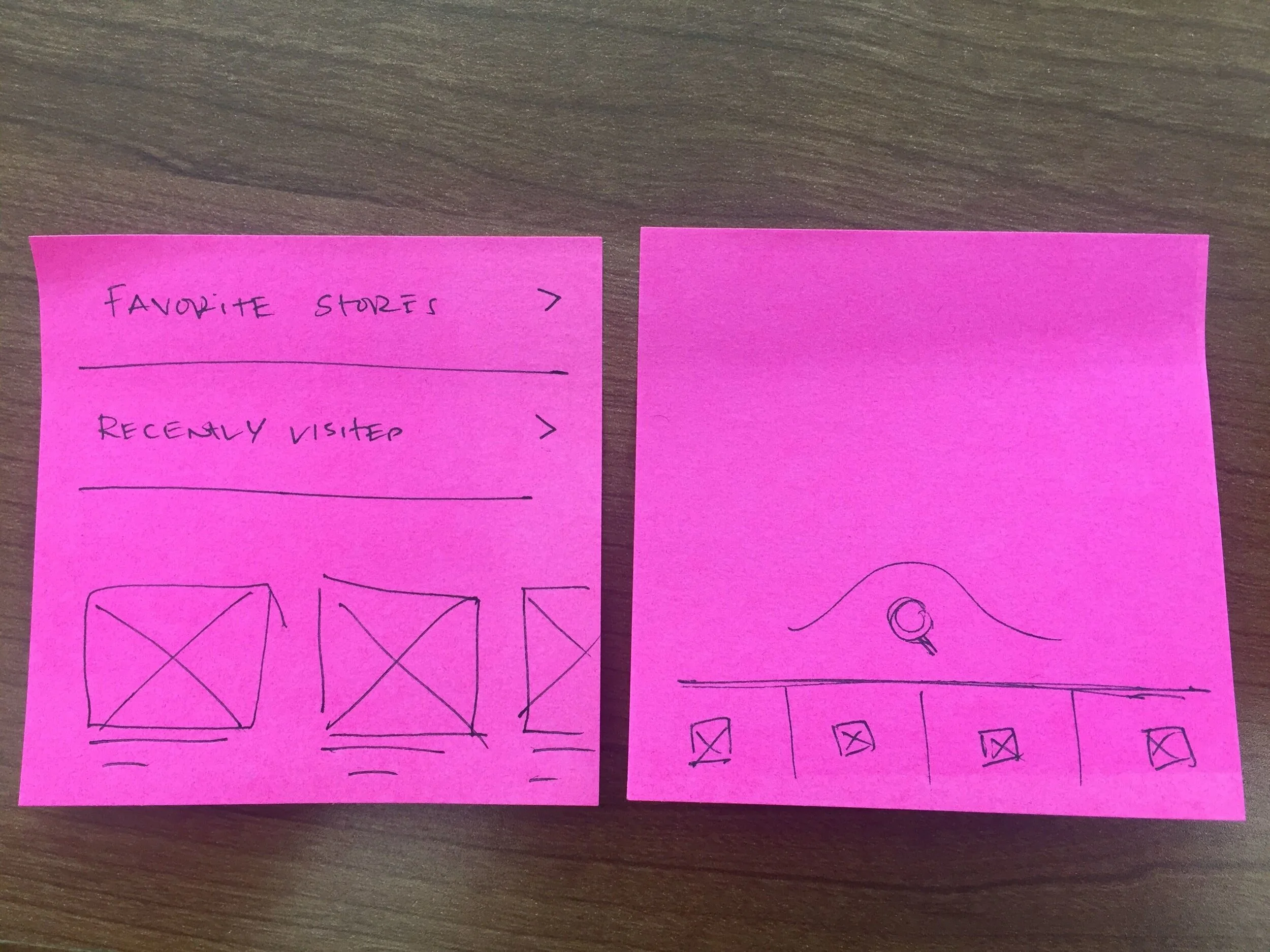
I created wireframe prototypes of several different design concepts. These prototypes were an invaluable tool for getting feedback from stakeholders and aligning on a design direction.
Test: Assessing usability
I conducted two sets of usability tests.
In the first usability test, 8 existing and 8 non-Rakuten members compared two different prototypes of new navigation. Participants were shown the prototypes in a randomized order to avoid recency bias. The low fidelity prototypes allowed me to design more quickly and helped participants focus on the broad picture rather than getting too focused on details.
In the second usability test, 8 existing and 8 non-Rakuten members compared a prototype with the live iOS app. As with the first test, participants were shown the prototypes in a randomized order to avoid recency bias.
Build: Developer handoff
I worked closely with iOS and Android front end developers to implement the new navigation interface. Developers were able to get most specs directly from Figma, which created a very efficient workflow and allowed Figma to be a single source of truth.
I created redlines where needed. These redlines were especially helpful to specify design tokens used for colors, spacings, and fonts.
Results: The proof is in the A/B test
Based on the usability test results, we felt confident about the design direction.
To truly understand the impact of our changes, we ran a randomized A/B test. The test was implemented through Optimizely and we used Amplitude to review the data. I was able to review the results in real time in Amplitude and clearly see when results had reached statistical significance.
Reflections
This project reminded me of what a huge impact tools can have on your workflow. During the course of this project, our design team switched from Sketch & Invision to Figma. Figma was an invaluable tool for increasing collaboration between stakeholders and team members, especially during developer handoff. Having a single tool to design, prototype, and present kept the team on the same page, reduced miscommunication, and allowed more time for iteration and UI polish.
This was also the first project where I got to use Rakuten’s newly developed design system. Being able to specify pre-build components and design tokens directly in specs was a huge timesaver during the UI review process. 🎉📐