Rakuten Shopping Experience
Designed improved shopping experience in Rakuten Rewards mobile product, leading to increased usability and ad revenue.
My Role
Researcher
Designer
What I Did
Research
Wireframes
Prototypes
UI Design
Timeline
4 months
Tools
Figma
Principle
Usertesting.com
Amplitude
What is Rakuten?
Rakuten (formerly Ebates) is a leading affiliate marketing platform.
Companies like eBay and Best Buy pay Rakuten a commission for sending users to their sites.
Rakuten splits that commission with users in the form of cash back.
When users shop on the Rakuten website or apps, they’re rewarded with cash back for their purchases.
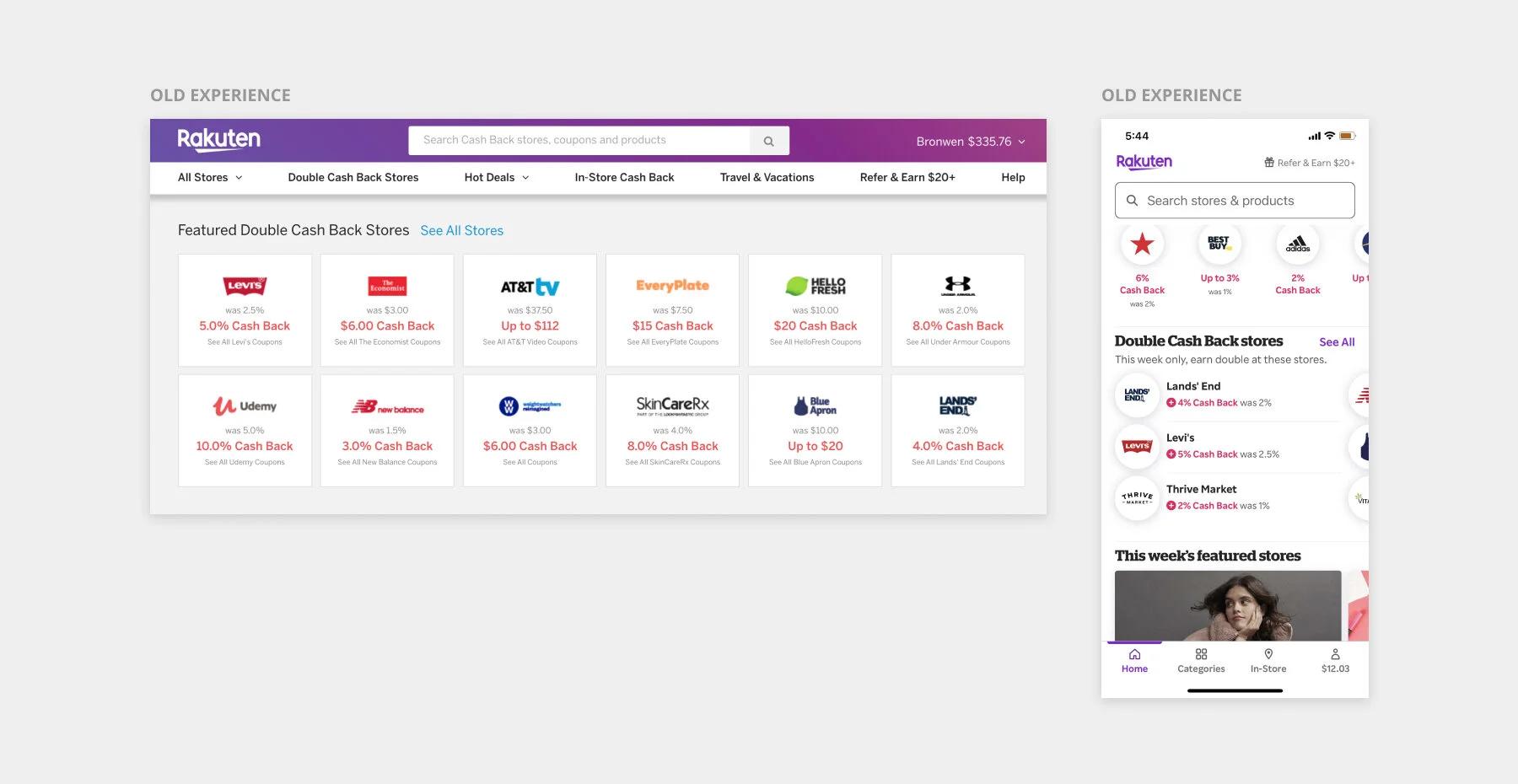
The problem
Our old user experience did a poor job of introducing customers to new stores.
If a user wasn’t already familiar with a store, there was little helping them decide if it was worth checking out.
However, we knew from our data that the more stores users shopped at, the more they would spend and the more cash back they would earn.
Our goal
As part of the Browse team, our goal was to improve the users browsing experience and discover new stores in an engaging way.
My design process
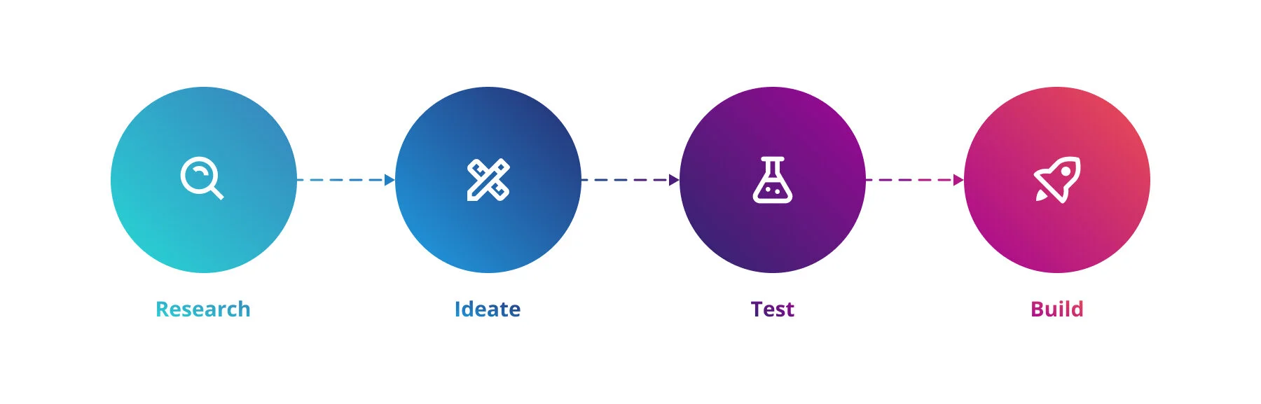
User interviews
To start this project, I began with research and discovery.
Through Usertesting.com, I conducted interviews with 10 Rakuten members to understand what prompted them to explore new stores. All participants had shopped with Rakuten within the last month, ensuring they represented our more engaged users.
I used Figma as a digital whiteboard to organize notes and create an affinity map of users responses. I found that most participants tried a new store because of a great price on a specific product. This reduced the risk of trying a new store and eased uncertainty about the purchase.
Team brainstorm
Focusing on products seemed like a clear solution. But before settling down that path, I wanted to get a range of ideas. I facilitated a remote brainstorm with my product team using Figma as a digital whiteboard.
The brainstorm included team members from a variety of disciplines, including engineering, product management, design and content strategy.
Do users engage more with products than stores?
To assess the product idea, we ran a quick test using existing components. This enabled us to get statistically significant data from a large sample of users in the wild, without using any development cycles. On the homepage of the mobile app, we displayed two different content blocks about Father’s Day. The first one showcased stores. The second showcased products.
We understood that choosing the right product to display to the right user is a complex choice. Due to technical limitations, these products had to be manually curated. So we showcased products with broad, mass market appeal. All the products were also under $50, making them appealing to impulse shoppers and deal hunters.
We saw that users engaged ~4x as much with products as they did with stores.
Soon after, we ran a similar test with a different theme and got similar results.
Based on these two tests, we felt confident that surfacing specific products would create a more compelling browsing experience.
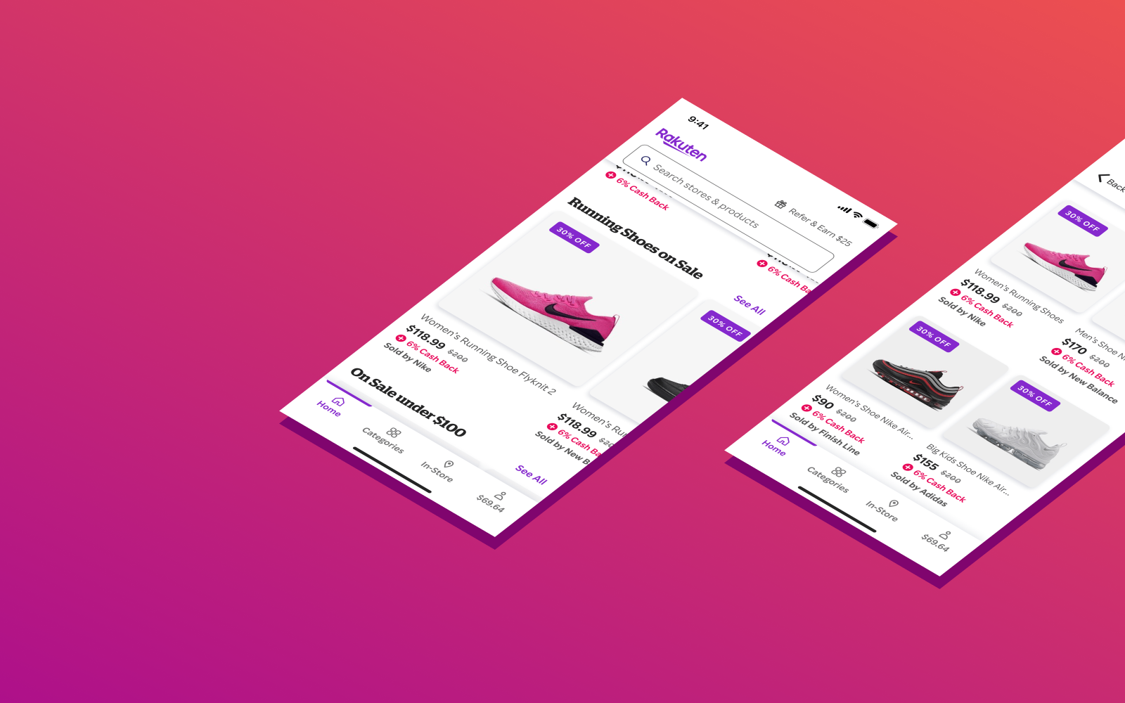
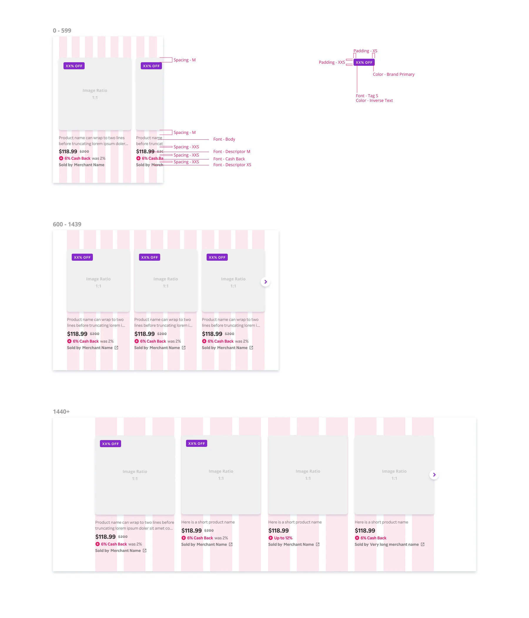
Product component design
Before jumping into interface design, I reviewed e-commerce experiences to understand trends and patterns in product components.
Product components always included an image, name, and price. They typically appeared in a horizontal carousel or two column grid.
Based on this information, I explored a variety of product component options.
To validate design choices, I conducted a usability test with 10 existing Rakuten users. I also got regular feedback from stakeholders and other members of the design team to align on a final design.
Visual qualities like colors, fonts, shadows and corner radiuses all used design tokens in our design system.
What products will we show?
Just as important as the choice to display products was choosing which specific products to show to which users.
Early on, we brainstormed what experiences we hoped to create. Identifying these specific use cases guided the designs and were a valuable prioritization tool.
We knew that users engaged much more with personalized content than generic content. Unfortunately, we didn’t have dedicated machine learning or data science resources on this project. So to create a personalized product experience, we leveraged existing store-based personalization algorithms. This allowed us to display content based on users shopping history.

Developer handoff
Once development began, I worked closely with iOS, Android, and web engineers to ensure designs were implemented correctly on all surfaces. I created documentation and specs, discussed the designs with developers in person, and conducted QA reviews.
Specs were handed off to developers using Figma, with more detailed redlines created where needed.
Final results
Once the component was built, we began surfacing products on the homepage. Personalized products were especially effective. They had an ~8% click through rate (CTR). This was one of the highest CTRs of any content on the app homepage.
In the first two weeks alone, products generated 84,000 shopping trips and $50,000 in media revenue.

Reflections
This is one of the first projects I worked on using Rakuten’s new design system. Being able to use already build subcomponents and design tokens in Figma was incredibly valuable in simplifying the design and QA process. Since the design system was still new, we were able to use this component to test and tweak our contribution processes. For example, we learned we needed clearer versioning of our design system files.
In the future, I would love to do more with personalization and refining what products users see. Because we were limited on back end development resources, we only scratched the surface of personalization. It would be exciting to have more granular access to users shopping behavior and use this to create more refined machine learning algorithms for surfacing products.
Lastly, this project reminded me of the huge importance of real time collaboration. This project was done during the Covid-19 pandemic, when everyone was adapting to remote work. I am so grateful for tools like Slack, Zoom, and Figma, which allowed us to stay connected and on the same page throughout the process.