Seesaw Desktop Redesign
Led redesign of Seesaw Learning’s desktop experience used by millions of teachers, students, and school administrators, leading to increased usability and conversion.
My Role
Designer
What I Did
Research
Wireframe & Prototyping
Design
Data Analysis
Timeline
10 months
Tools
Figma
Amplitude
UserBrain
Lyssna
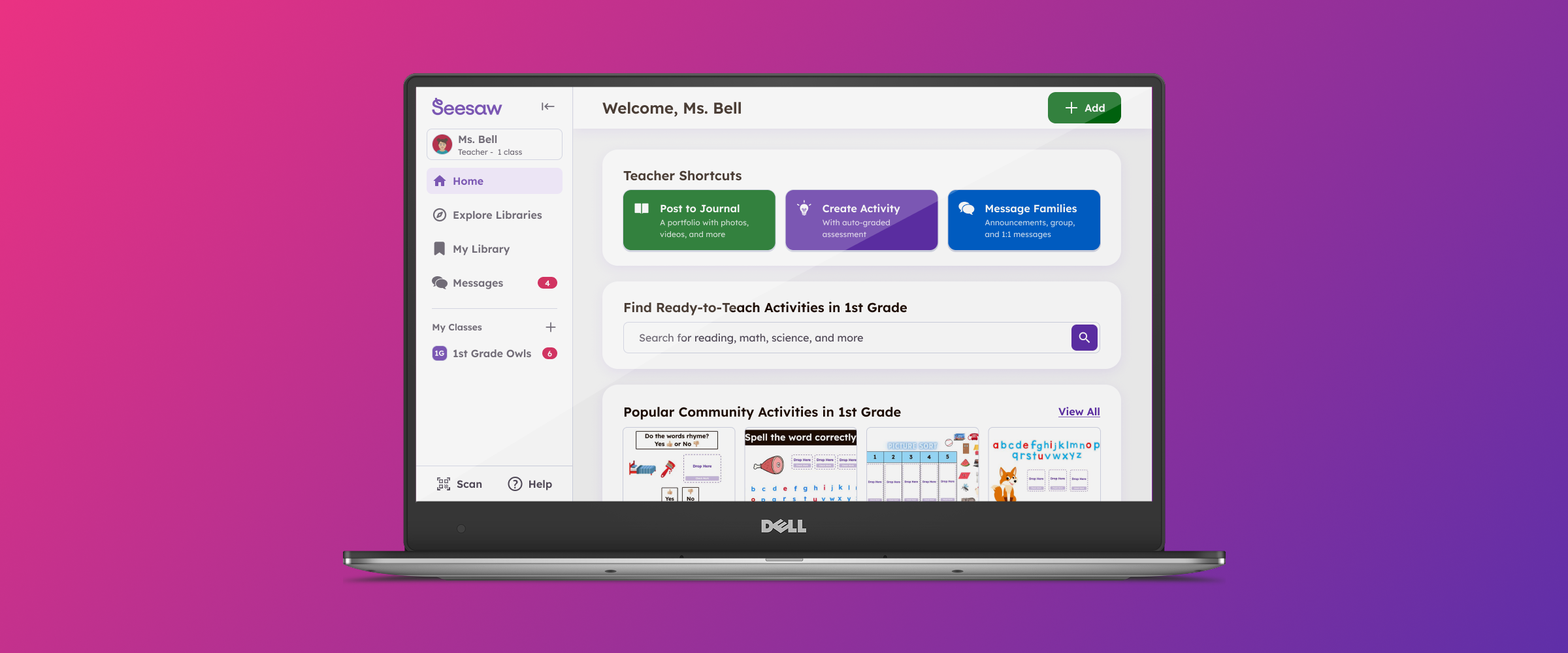
What is Seesaw?
Seesaw connects 25+ million teachers, administrators, students, and families to support each child’s learning journey from PreK through 6th grade.
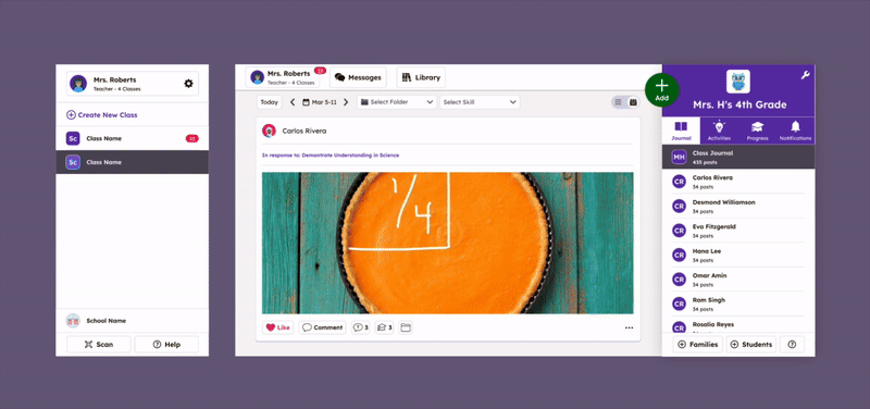
Within Seesaw, a teacher can:
Assign interactive digital activities to to students
Send 1:1 and group messages to family members
Document student work in a digital portfolio
The problems
Over the years, we’d heard consistent feedback that our navigation could be confusing, especially for new teachers just getting started. The experience often felt disjointed—jumping from one part of the product to another without a clear sense of everything Seesaw had to offer.
In addition, our old experience made it very challenging for the product to scale over time, for example adding new features or localizing the product smoothly into other languages.
Where I always start: research
🎙️ Conducted Stakeholder interviews to help align on project goals.
📊 Analyzed current product usage metrics and key funnels.
🧐 Conducted competitive research of edtech products to identify common patterns.
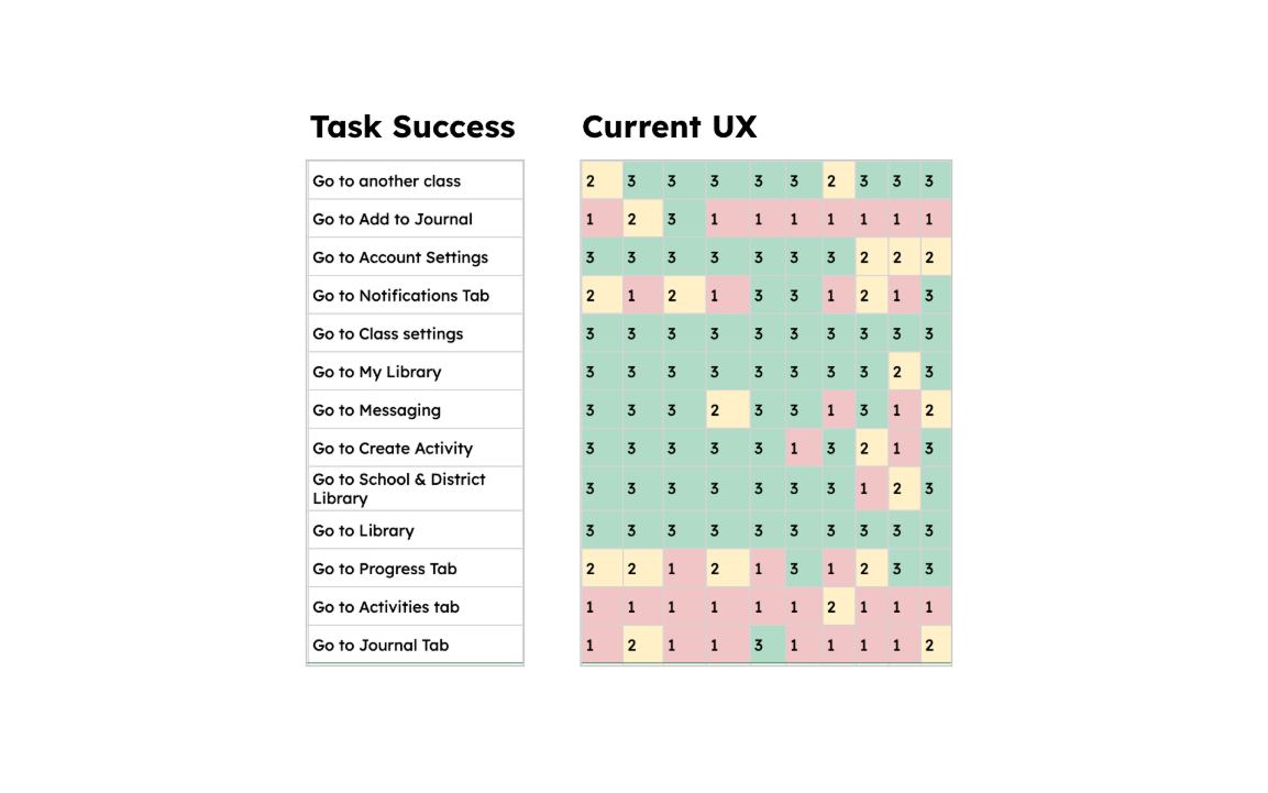
🧪 Conducted interviews and usability tests of current product with new and existing teachers.
Aligning on project principles
Get them to the starting point
The biggest drop off in the funnels was reaching the correct part of the product. For example, in a given month, 70% of teachers never went into Messages.
In interviews, many new and even existing teachers were not aware of all the functionality Seesaw had to offer.
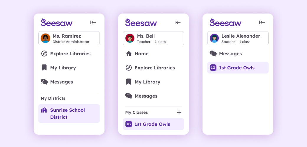
Teacher and student experiences should match
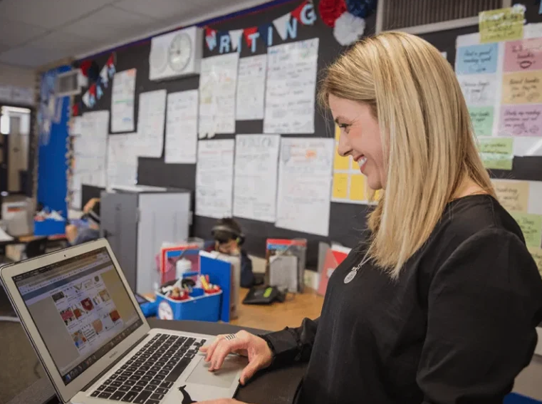
Elementary teachers will often model to students using the teacher’s computer.
Having the teacher and student experiences match wherever possible was important to facilitate this modeling.
Avoid mid-year disruption for existing teachers
Introducing a large change mid-year had the potential to severely disrupt teachers with limited time.
Avoiding mid-year disruption shaped our testing and rollout strategy.
What I did next: design & testing
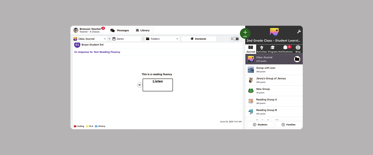
📐 Created wireframes and prototypes.
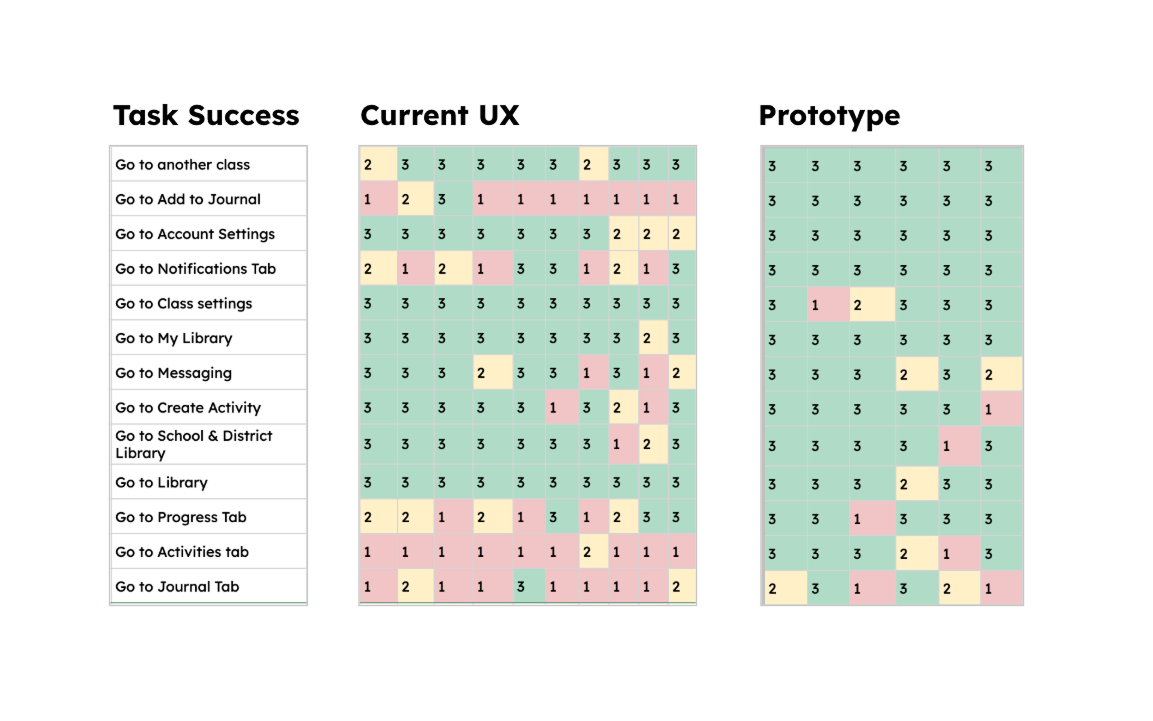
🧪 Conducted usability tests using prototypes with new and existing teachers.
🖼️ Conducted concept tests with existing teachers.
🧪 Worked with engineering to develop an A/B testing strategy using LaunchDarkly and Amplitude.
Aligning the team
Mid way through the project, I created this animation to help align the team and create a shared understanding of project scope.
Although the designs weren’t final, it helped the team quickly understand that many changes were simply moving existing elements into more logical places - while some changes were net new, like adding a homepage.
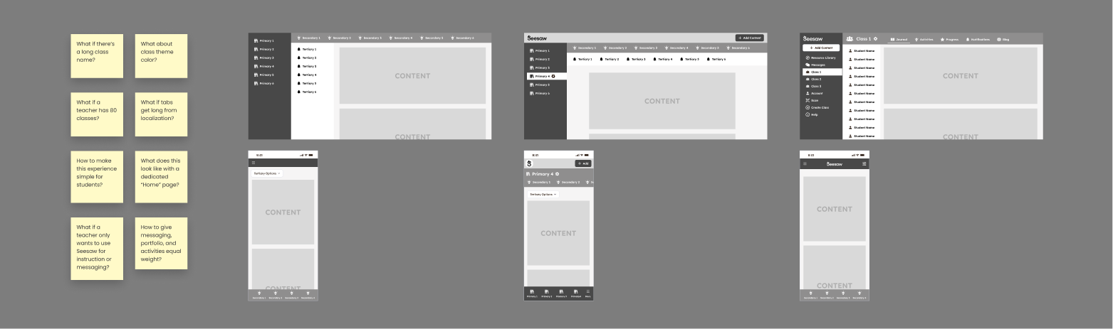
Sweating the details
Once we’d aligned on a general direction and structure, there were countless details to work through. Through every choice, we considered where changes would be valuable vs. disrputive, how to create consistency, and how to create a scalable system.
The final results
The new experience resulted increased conversion and set a flexible foundation to easily add new functionality.
Quantitative wins:
40% improvement in median time to send first message
14% relative increase in sending messages
YOY improvements in entering Messages and Library
<0.6% opt out rate when rolled out to all teachers
User quotes:
“It looks really updated and clean. It’s easy to find what I am looking for!”
“Everything looks great! I love the changes.“